Case Study: Navigation Pattern Research for Boston University’s Brand Evolution
user research // ux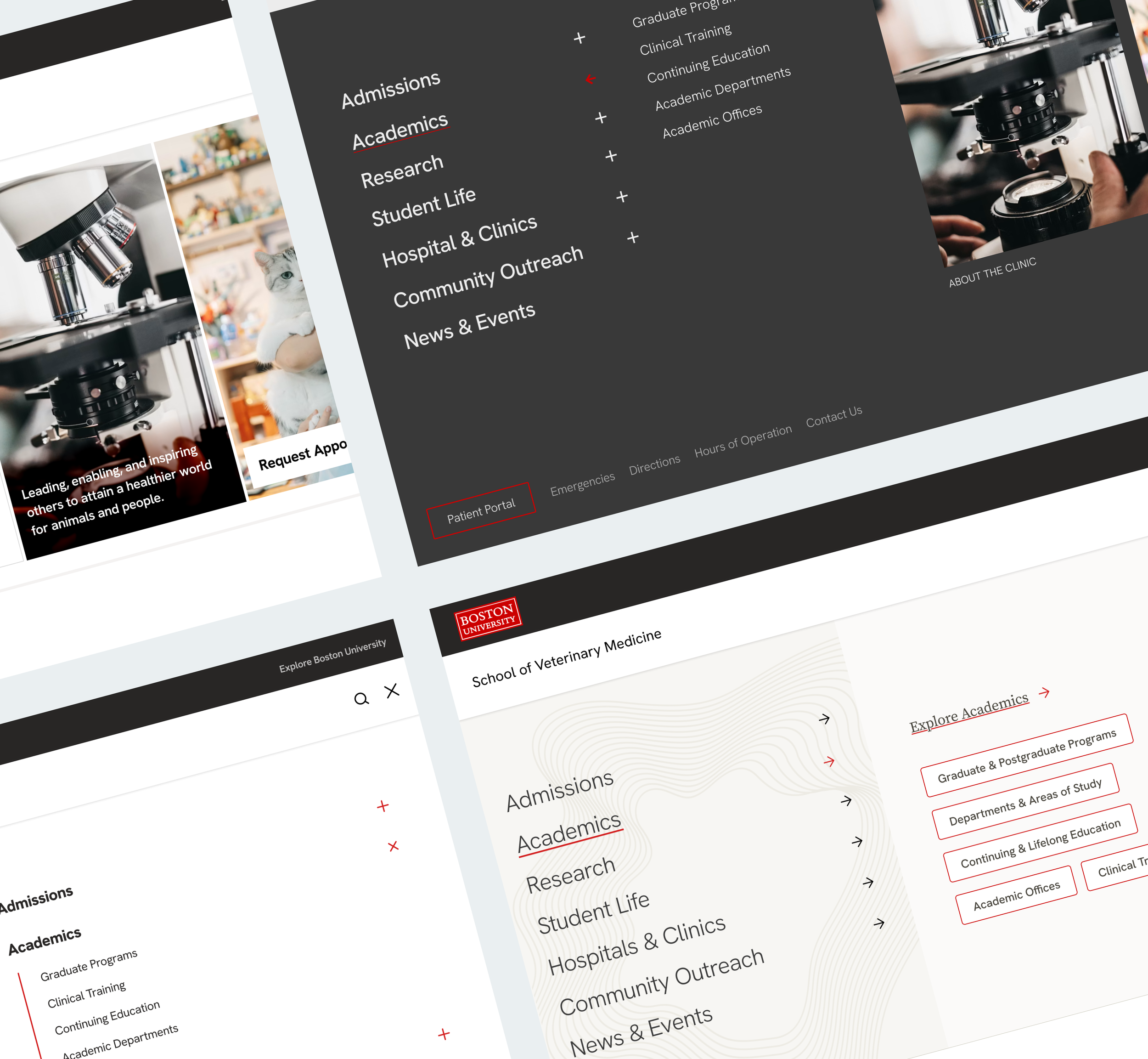
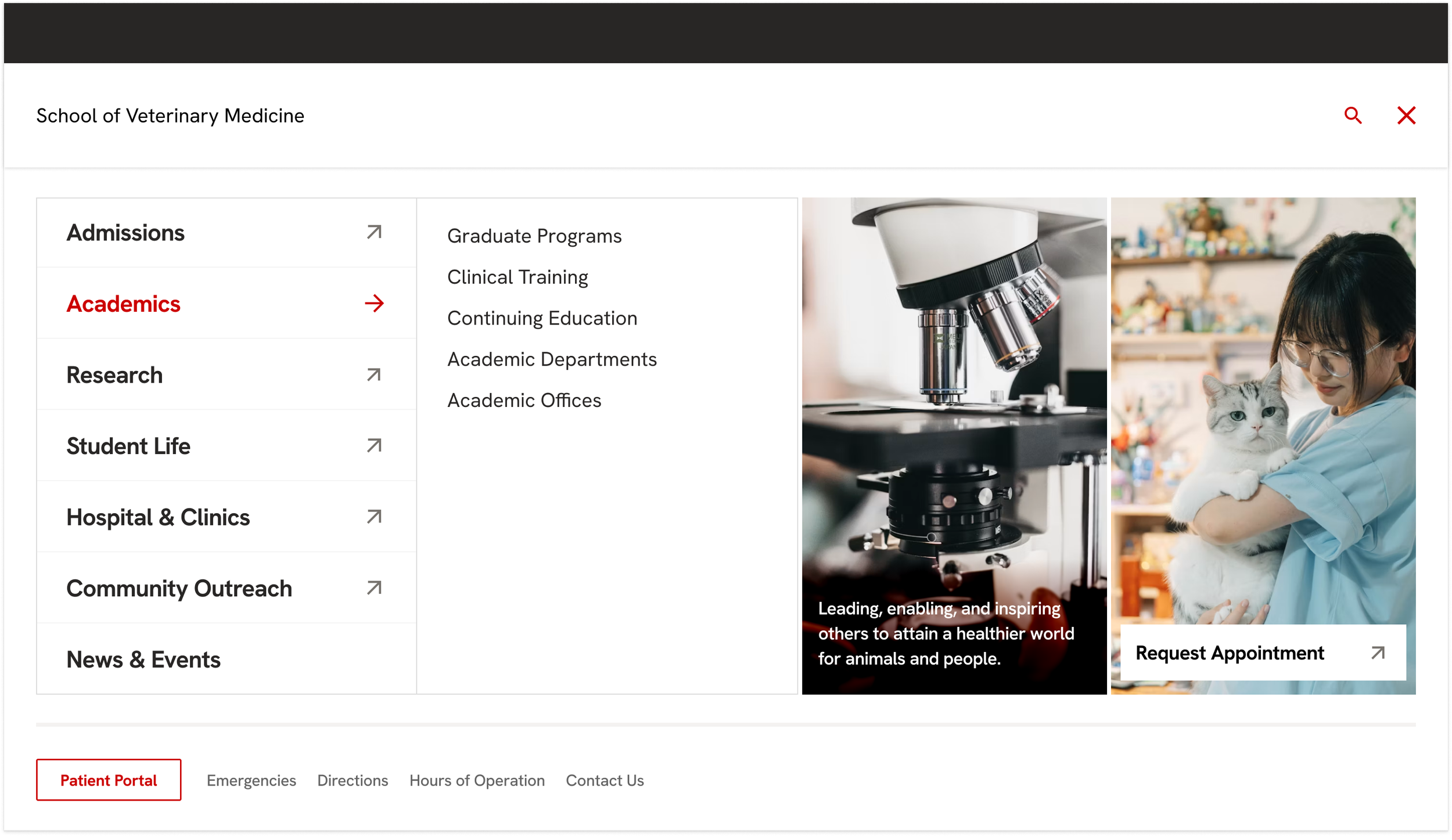
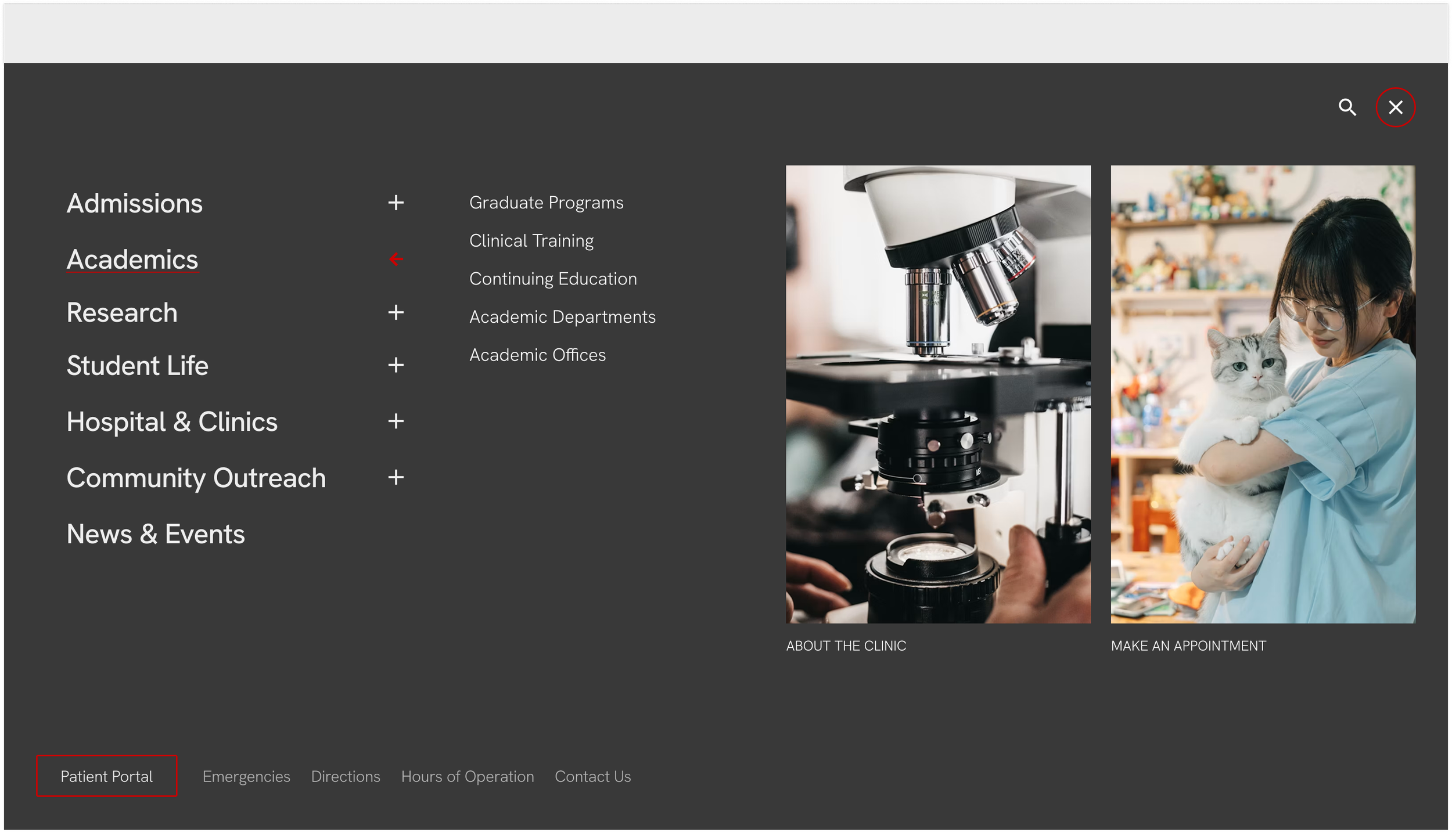
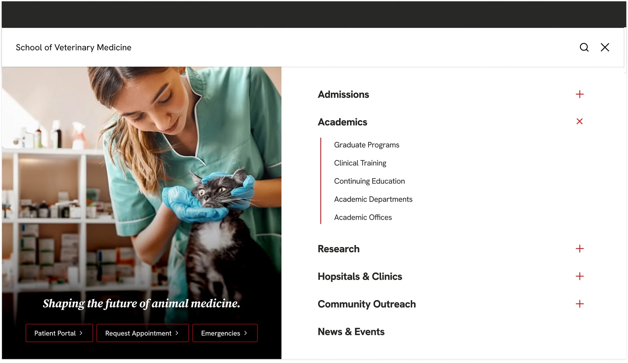
As Senior Lead, I led user research to evaluate and improve the full-menu navigation pattern for Boston University's framework, with the goal of uncovering why analytics showed users weren't engaging with the current pattern as expected. I worked closely with stakeholders to lead the overall strategic vision of the work, while partnering with and directing other designers to develop a research-based test plan, prototypes, and a test-ready information architecture, as well as to analyze the results. Through user testing, we revealed how users intuitively navigate and arrived at a recommendation designed to work with those instincts.
Project Objectives
01
Evaluate and test three distinct navigation patterns to identify which best supports how users naturally discover and navigate content.
02
Understand user needs and preferences by testing user behavior across different navigation patterns.
03
Define an intuitive navigation structure that enables users to find what they are looking for quickly and with minimal confusion.
Research Hypotheses & Test Development
Next, we turned our assumptions into hypotheses: clear expectations about user behavior and usability problems for each navigation pattern, as well as for the system as a whole. Framing them this way made it easier to prioritize what to test and how, and to design a test that would let us measure outcomes and gather real data. After putting together our hypotheses, we began developing tasks and prototypes to use in our tests. At the same time, we developed our own information architecture for the tests so that we could ensure that lack of institutional knowledge did not become a barrier when navigating the prototype.
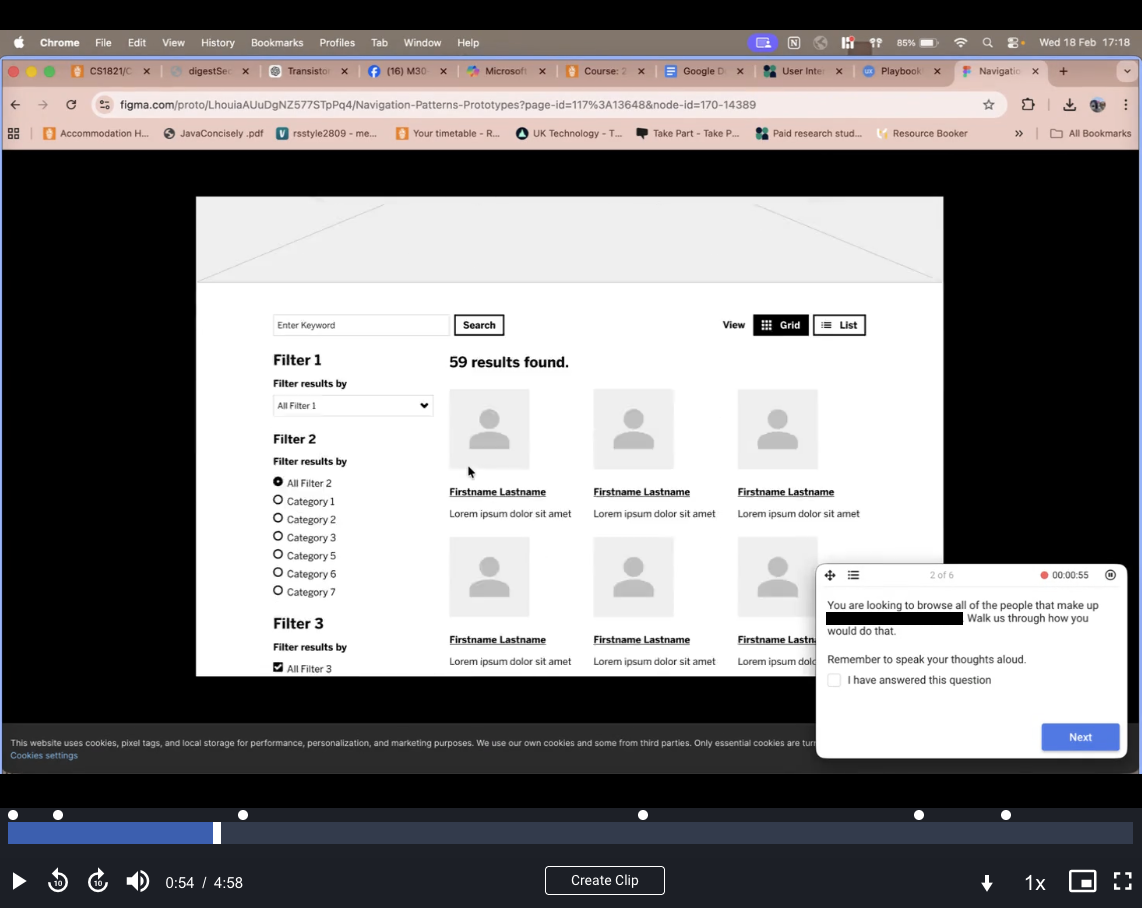
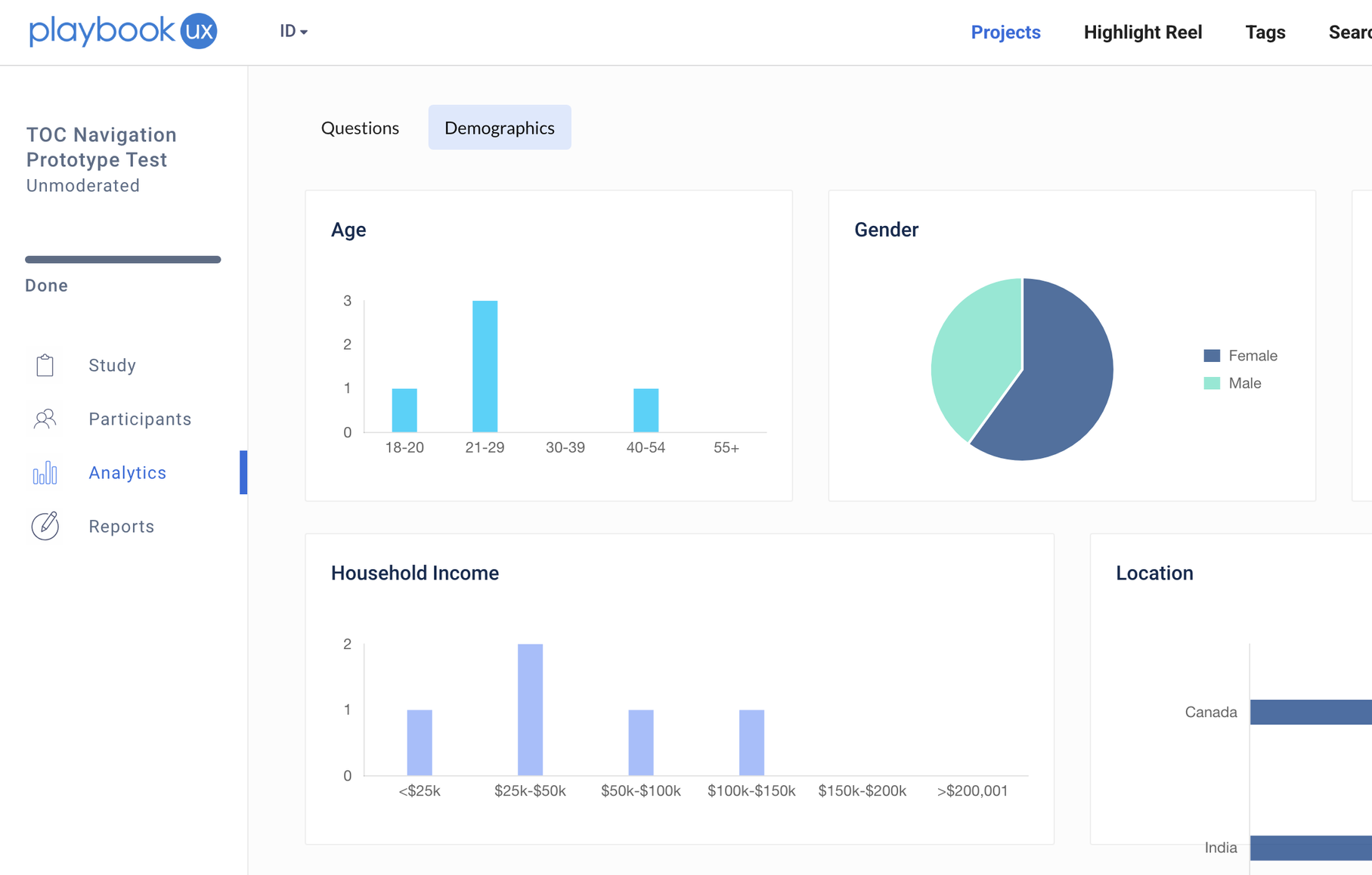
We ran our prototype testing through PlaybookUX. We
conducted fifteen tests (five for each navigation pattern) using participants ages ranging from 18 to 55. Recruitment was limited to countries where BU applicants and site traffic are concentrated and available through the platform. PlaybookUX provided us with video recordings and transcripts for every test.
Test Analysis with Affinity Mapping
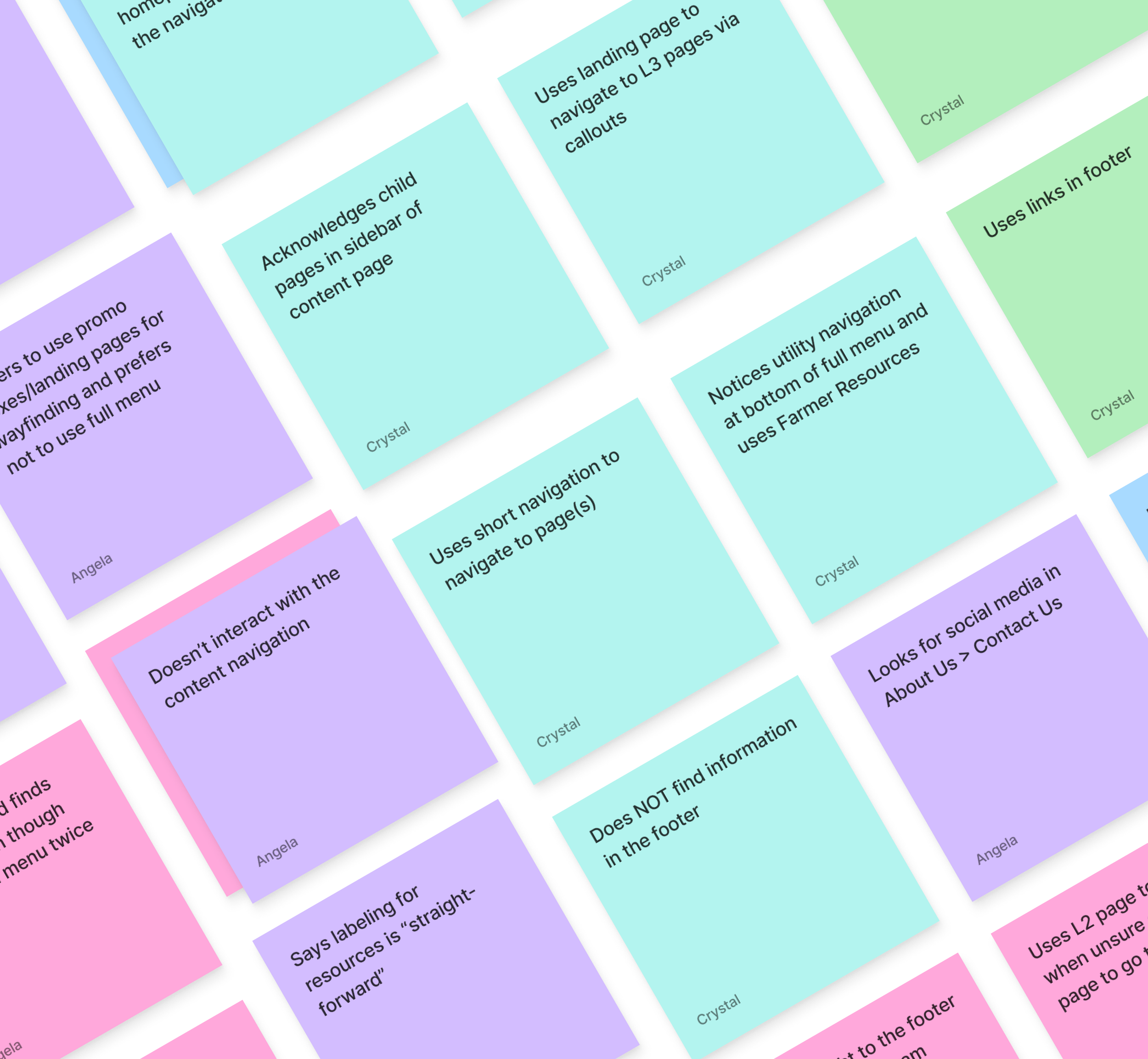
We used affinity mapping to organize our findings. We captured user behaviors and pain points on individual sticky notes without overthinking each one, then grouped them into themes and trends to reveal the bigger picture. Once each theme was identified, we prioritized the most important ones to target and used them to shape our recommendations. The themes that emerged were:
Homepage / landing page navigation preference
Preference for 2nd-level links vs. 3rd-level links
Full menu visibility (bottom menu items)
Use of content navigation, or lack thereof
Shorthand navigation expectations
Visibility of utility navigation
Use of footer links
Labeling and section summaries
Location of social media and contact info
Unsatisfactory use of quick links / utility navigation
Landing page vs. expanding menu behavior
Effectiveness of audience-based / utility placement
Intuitive section expansion
Need (or lack thereof) for full visibility of 3rd-level navigation
Interactions with audience-based navigation
Key Findings & Recommendation
Finally, after going through and mapping all of our data, we were able to surface some really strong insights that could inform our recommendations. There were many more insights that were surfaced, but for general recommendations specifically for the primary navigation, this is what we found:
Users prioritize landing pages as their initial navigation point, even when menu navigation eventually leads them to child pages.
Users search for content at the highest level first. They progress to increasingly deeper pages (L2, then L3) only when needed, rather than navigating directly to lower-level pages.
Users readily scroll to view page content. So there is no concern about users seeing content further down the page.
The menu functions as a secondary, complementary navigation tool rather than the primary method. Users prefer to discover content within the page context itself.
Users reference level 3 page links within the full menu to determine which level 2 page to visit, using them as contextual guides rather than direct destinations.
L3s function as scannable lists. Users scan quickly to locate their destination, bypassing content that doesn't immediately signal relevance.
While the current navigation had no critical usability issues, our research revealed a significant insight: users prefer to use landing pages to navigate over being taken directly to the page most relevant to them via a full menu. This preference fundamentally shifts how the navigation should be structured. Rather than exposing all level 3 links prominently within the primary navigation, a strategy that misaligns with actual user behavior, the pattern that should be adopted must prioritize easy access to level 2 landing pages as the primary destination, positioning level 3 links as optional, supportive context, not as navigation necessities, but as contextual aids that support users' next steps. The result: less cognitive load, a more streamlined experience, and more confident navigation toward the right destination.
Pattern Design
Based on these insights, we wanted to create a navigation structure that combines clear hierarchy with efficient, flexible access to content. Users benefit from an organized structure that makes sense at a glance, but they don't want to be locked into menu-dependent paths. They prefer to browse organically. At the same time, they need shorter, more direct routes to landing pages without losing that flexibility. Bringing these strengths together creates a structure with clear hierarchy, multiple pathways, and a streamlined experience that prioritizes landing pages without sacrificing contextual support. We also recommended improving audience-specific navigation, either by repositioning and relabeling it for better visibility, or by redefining its role based on usage analytics.
This pattern is still in development. If you're curious to learn more or see what I'm working on, feel free to reach out! In the meantime, here are some iterations I put together to demonstrate our recommendation: